@H5mag
Web typography in H5mag
Text is and continues to be one of the fundamentals of the web. In the beginning of the 2000s there were thousands of typefaces available, but designing for web meant you were limited to a fixed set of web safe fonts. Fonts like Arial, Times New Roman, Verdana and Comic Sans were seen almost everywhere.
Of course there were ways to have nicer type by using raster images or techniques like sIFR or Cufón, but these had significant impact on page load times, were not indexable by search engines or relied on JavaScript/Flash.
With the arrival of CSS3 more and more browsers adopted the new standard which gave designers freedom of choice and the possibility to customize the typography to the brand across all media.
Did you know? Font downloading was already available in CSS2 but because of licensing issues and browser adoption this was largely glossed over.
Advantages of using web type
By using webfonts your content is accessible on all devices. This also means that all the text can be indexed by search engines like Google, Bing and DuckDuckGo (privacy conscious search engine). So if someone searches for a term used in your magazine and opens it on his mobile phone, he will automatically be presented with the relevant page in the magazine with an optimised view for his screen size.
Custom fonts
Adding and using custom fonts is built in our editor. You can use the extensive library of fonts.com or one of the many free fonts made available on Google Fonts. If you have your own webfont files you can also upload them yourself, just make sure you have the correct license to do this.
Best practices
Readability
With H5mag's artboards you can customize the style of your magazine which includes the typography. This way it's possible to optimise the legibility to your liking for different screens.
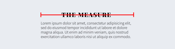
Measure
Take the measure into account when making a design. The measure is the length of a line of text. If a measure is too long the content will be harder to read because it's easier to lose harmony from one line to the next. A good rule of thumb for a measure is 45-75 characters per line.
Font sizes
Another thing to keep in mind is the font sizes. In the editor the text will appear to be larger than when you view it on a tablet or mobile phone. We would recommend to test the type on a real device first. A size of 14px for body text on tablet and 20px on mobile is a good guideline (depending on your typeface)
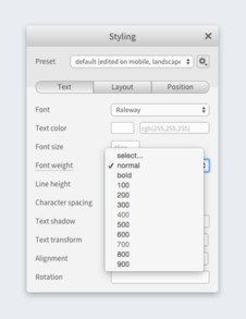 Webfont weights
When you’re using different font weights on the web the weight is determined by a number. If the font was set up correctly the numbers correspond to the following weights:
100 Extra Light, Ultra Light
200 Light, Thin
300 Book, Demi
400 Normal, Regular
500 Medium
600 Semibold, Demibold
700 Bold
800 Black, Extra Bold, Heavy
900 Extra Black, Fat, Poster, Ultra Black
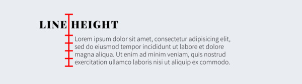
Line height
On the web it is best practice to set the line height without a unit, this will make it relative to the font size. So if you adjust the size of your text, the line height will scale accordingly.
Resources
- Practical Typography Very comprehensive online book about typography. It’s made available for free but consider supporting the author if it helped you.
- Font Library Library of free (as in speech) and open source fonts
- Font Squirrel Web font generator A webfont generator. If you have font files, don’t have the web variant available and the license permits web usage.
Want to know more? Take a look at h5mag.com for more information or contact us at info@h5mag.com!